The Rifle, Axe, and Plough
A reprinted and remixed twitter thread, in which I advocate for Minnesota to change its state emblems.
Friends, this JOHR essay is a bit unusual. It’s not even an essay.
Earlier this week I posted a thread on Twitter of my thoughts on the Minnesota state legislature advancing a bill to reconsider and redesign the flag and seal of the state of Minnesota, my home state. “Minnesota should change its flag” has been one of my weird little political and cultural hobbyhorses for years, so I’ve been glad to see the matter gaining steam.


Anyway, the thread I wrote on Twitter got some minor attention — not virality, but at least it broke through the fog of tweetstream, and I know that some prominent MN decision makers, including lawmakers, have seen it. Most notably, the organizations that are advocating for a new flag have spread it to their followers. So I thought I’d share it with my Jase of His Rocker audience, since you all are interested in anything I have to say about anything, even flags. (Ha! That was a joke.)
The format and syntax will seem a bit choppy, unlike the meandering discourse that characterizes most JOHR essays. That’s due to this piece’s origins as a set of tweets on Twitter. Twitter’s 280 character limit is a good constraint for a fellow who loves a twisting sentence and a subordinate clause.
I also think sharing this little twitter thread will spur me to share more writing with you, soon. I have several JOHR essays in various states of completion. The madness of the world has been tough to keep up with, and whenever I think I have something worth sharing, some new madness arises that sends me back to my drafts. But I’ll just start sending them out, knowing that they are incomplete and quickly obsolete.
I’ve made a few minor formatting improvements (subheads, dividers) and superficial language changes from my original thread of tweets. I also added the epigram, for context.
An epigram
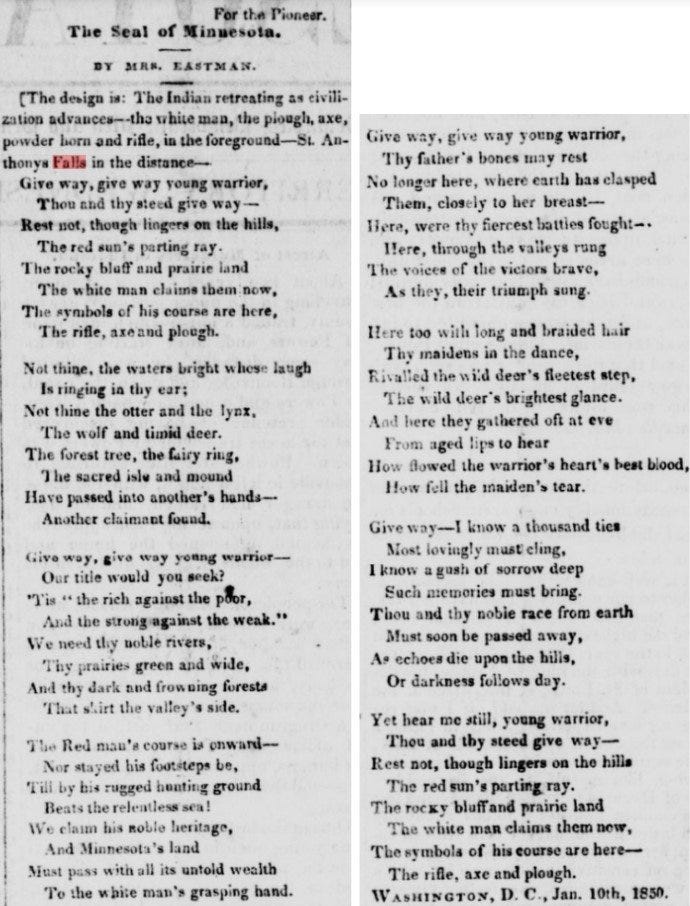
Give way, give way young warrior,
Thou and they steed give way —
Rest not, though lingers on the hills,
The red sun’s parting ray.
The rocky bluff and prairie land
The white man claims them now,
The symbols of his course are here,
The rifle, axe and plough.
-The opening stanza of The Seal of Minnesota, by Mary Henderson Eastman, as printed in The Minnesota Pioneer newspaper, February 1850.
MN bill HF284 moving through committee
The MN legislature is advancing a bill to redesign our #MinnesotaFlag.
Story: https://www.house.leg.state.mn.us/SessionDaily/Story/17274
It's been a pet issue of mine for years.
I've heard chatter about this being a waste of time, so to win hearts and minds, I thought I'd share some thoughts.
A thread.
First, my qualifications: None, really.
Except: I'm a proud Minnesotan who loves this state and cares about our history, present, and future.
I also have an ordinary human's natural interest in matters of language, symbols, and design.
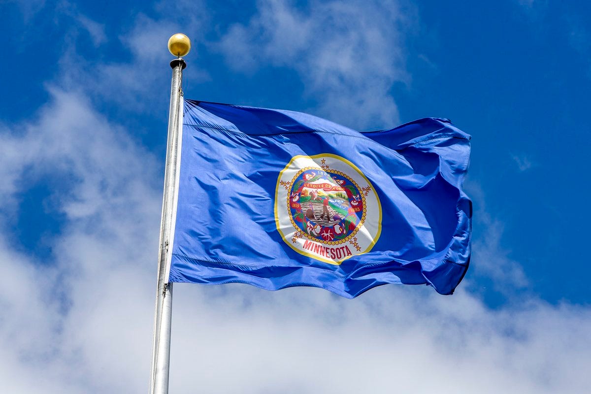
Now, let's start by considering our current Minnesota state flag. Can you picture it? If I gave you a box of crayons, could you draw it?
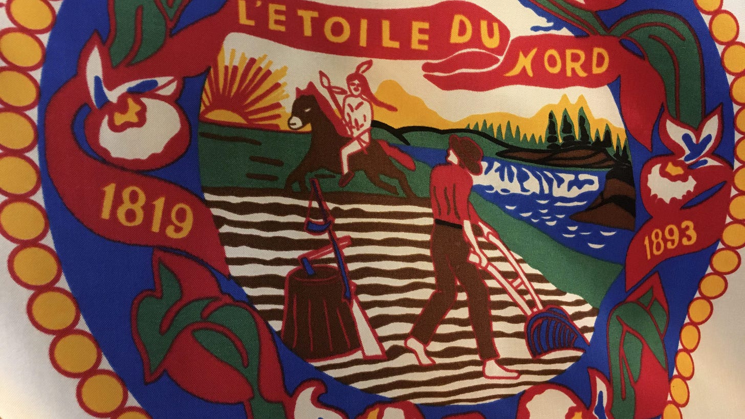
Here it is. Kind of boring, really. It's the elaborate Minnesota state seal (more on the seal in a bit), wrapped by the word "Minnesota," on a plain background.
But boring isn't the problem. Japan's simple red circle on a white background is boring, I suppose, and yet it's a strong flag.
No, the problem is vexillological. ("vexillology" = the study of flags.) As a flag, Minnesota's fails.
Vexillologists (flag geeks) have outlined 5 principles of good flag design.
Keep It Simple.
Use Meaningful Symbolism.
Use 2 or 3 Basic Colors.
No Lettering or Seals.
Be Distinctive or Be Related.
See https://nava.org/good-flag-bad-flag
Minnesota's flag falls short on all accounts!
It's 0 for 5 on the principles of vexillology!
That's some vexing vexillology.
Think of some flags you like. Here are a few of mine:
USA's stars and stripes
State of TX
State of CO
City of Chicago (cool flag!)
Canada (that maple leaf!)
UK's union jack
The Bleu, Blanc, et Rouge of France
Jamaica
Kenya
(There are more).
These cool flags elicit an immediate, powerful response. If you saw one atop a ship's mast, on a distant hill, or on an Olympic jersey, you'd recognize it immediately.
A complex seal on an indistinct background, like MN's flag, can't do that.
So that's the first problem. The flag fails as a flag.
About that State Seal
The other problem is the seal that's the heart of the Minnesota flag's design.
It's seriously problematic.
It's a depiction of white settlers displacing Native Americans.
You think I'm overreacting? Reading too much into it? Too "woke"?
Check out the poem that accompanied the early visualization of this seal.
This poem describes the scene that the Minnesota seal illustrates.
Here it is, from an 1850 newspaper. Read it.
I know: Yikes!
I'm an English major, so indulge me while I interpret a few stanzas.
The poem opens "Give way, give way young warrior / Thou and thy steed give way."
That's the poet demanding the "young warrior" leave immediately — and the horse he rode in on, too ("thy steed").
Then: "The rocky bluff and prairie land / the white man claims them now."
In other words: We're taking your land. All of it. Hills to prairie. The whole thing. All the animals, too ("otter, lynx, wolf, deer"). That includes our local NBA and WNBA mascots, by the way.
Later, we read "Thy father's bones may rest no longer here."
That's harsh. The poet doesn't even want the young warrior to leave the buried bodies of his ancestors. He wants all trace of the native people erased.
The heart of the poem: "And Minnesota's land / must pass with all its untold wealth / To the white man's grasping hand."
That's the crux of the piece. The white man has to ("must") seize the entire place — a land grab, literally.
The most chilling couplet is this one: "Thou and they noble race from earth / must soon be passed away."
Wow. That's a call for the young warrior's entire race to be wiped "from earth." That's a call for genocide.
Can you read it another way?
You get the point. The sentiment behind the current Minnesota state seal and flag is undeniably awful, and has caused serious harm to people throughout history.
While history can't be erased, retiring this flag would be a step towards reconciliation and redemption.
So: the current flag is boring, it's bad design, it's not memorable — and it's rooted in an awful, genocidal, immoral sentiment.
I'm not one for overturning traditions lightly (you should see me at Christmas), but that sounds like a good case for changing it.
An Alternative: The North Star Flag
Which brings us to the next question:
If we change the Minnesota State flag, what should we change it to?
How do we go about coming up with a new, better, cooler, less awful design?
On that, I have good news.
Smart, capable people have been working on new designs for the MN state flag for years. The most popular such design has proven to be something known as the "North Star Flag."
It was developed by fellows named William Becker and Lee Herold back in the late 1980s.
Check it out.
A few bold colors. You could draw it with the small pack of Crayolas.
The star represents the MN motto, "Star of the North"
The wavy stripe evokes our legendary lakes & rivers.
The white in that stripe evokes our legendary winters.
Cool flag!
And even better, this North Star Flag has already gained grassroots traction. You'll find it at gift shops, on laptop stickers, flying from flagpoles at lake cabins. Minnesota United fans even fly it (and custom variations) at Loons matches!
So I, an ordinary Minnesotan, whole-heartedly suggest we retire the current seal and flag.
And rather than engage in a lengthy, costly effort to find a replacement, I suggest we adopt the North Star Flag, a sharp looking, market tested, vexillologically strong banner.
Read more about the North Star Flag here:
(I have no affiliation with this group other than following them on twitter.)
If you are a fellow Minnesotan and you agree we need a new flag, please retweet this thread to spread the news — and contact your legislators.
And thanks for reading.
CC:
@GovTimWalz
@_RyanWinkler
@SenRonLatz
@NorthStarFlagMN
That was the end of the Twitter thread.
If you happen to be a Minnesotan who agrees with the calls for a new flag and seal, I encourage you to contact your state representatives. The bill that was advanced this week calls for “a commission to develop, design, and recommend to the legislature and governor new designs for the official state flag and the official state seal no later than January 1, 2023.” And if you hear folks complain that this seems like a superficial issue and a waste of time, I especially encourage discussions about the Eastman poem that illustrates the tableau on the current seal and flag. To the casual observer, the scene may seem relatively innocent, if a bit dated. But I think its serious problems become apparent if you consider the Eastman poem calling for the “young warrior” to “give way” to “another claimant,” “the white man.”
Lastly, the bill passed the subcommittee on a party line vote, with DFL* members approving it and Republican members opposing. (*Non-Minnesotans: the “DFL” is our state’s Democratic party.) None of the dissenting Republicans offered an explanation of their “nay” votes. Perhaps some dialogue and support from Republicans would help the bill gain traction. Surely at least some of them would find the sentiment in Mrs. Eastman’s poem abhorrent. If you are one, or know one, I especially invite you to consider the aesthetic and cultural issues raised by our flag, and discussed in this post.
Image credits:
“The Seal of Minnesota” poem reprint is from the Minnesota Pioneer, shared on Twitter by user @drewross23, November 11 2021.


North star flag is from Creative Commons: Soundoftoday, CC BY-SA 3.0 <https://creativecommons.org/licenses/by-sa/3.0>, via Wikimedia Commons
Most other images are from the North Star Flag project: https://mnflag.tripod.com/


I love the North Star Flag for Minnesota’s State Flag! You did a wonderful job explaining what each color represents, but I am married to a farmer and feel the green represents our rich farmland and forests.
I can’t think of a good reason for me to care about MN’s flag, yet now I do! Adopt the North Star Flag!